
JagLine
Boosting dependability through an unsolicited redesign of IUPUI's campus bus application.

Background

In 2021, I set up this project alongside four graduate peers to practice UX research, however it came to an abrupt end after interviewing, usability testing, and distinguishing key findings. In 2022, I picked it back up and embarked on the redesign process. Using the Lean UX Design framework (think, make, and check), I individually transformed the team's research data into distinct changes, prototyped these changes, and tested the prototypes to maximize usability and user satisfaction.

My team launched a research protocol in three phases to collect quantitative and qualitative data from JagLine and public transportation passengers.
Phase 1: Interviews and Contextual Inquiries
In Phase 1, we identified pain points, user goals, and primary issues with the JagLine app. We formed an affinity diagram with the qualitative data retrieved from our ten interviews, which uncovered the subsequent categories: problems related to bus stops, tracking, map display, ease of use, and information visibility.

Phase 2: Inspection Methods
The second stage consisted of user, environment, and task analyses. Considering the information gathered in Phase 1, we detailed the contexts in which students use JagLine's app and the tasks they do in it. We selected two core tasks representative of the app's minimum viable product (MVP) to create hierarchical tasks analyses (HTA) diagrams.
Task 1: Searching for a Bus Stop

Task 2: Checking Bus Capacity

Phase 3: Think Alouds and Self-Reporting
For Phase 3, we tested JagLine's usability and prompted ten participants to think aloud the two HTA tasks from Phase 2. We concluded each session with a brief self-reporting questionnaire based on the System Usability Scale (SUS); this survey sought out users' perceptions of JagLine's usefulness, enjoyment and complexity. The average SUS score was 61.0, which is lower than the acceptable average of 68.
Examples of task evaluation criteria from usability testing


User Types
From my team's analysis of JagLine, I found that major differences lie between two core user groups: domestic and international students. They both use JagLine to track buses, but for their own particular goals and reasons.

Key Research Findings
Sifting through think aloud feedback, I translated participants' repeat comments into overarching themes and problems. Both user types confronted the four key issues below.

Ideation
Near the beginning of my individual redesign, I converted the key research findings into user requirements to guide my solution. Based on the three requirements below, I brainstormed remedies that I could prototype for testing.

Check
I recreated the JagLine UI in Figma and updated it with my proposed adjustments. Then, I conducted remote usability tests with users of the JagLine bus system to evaluate the new features and functionality. In this test, I asked 14 questions across 4 screens. Afterwards, each participant filled out the 10-question System Usability Scale (SUS) survey. The mean SUS score was 61.0 in Phase 3 of initial research. My proposed prototype's SUS score was 63.3, which is an increase from the original design, but still below the acceptable average of 68.0.

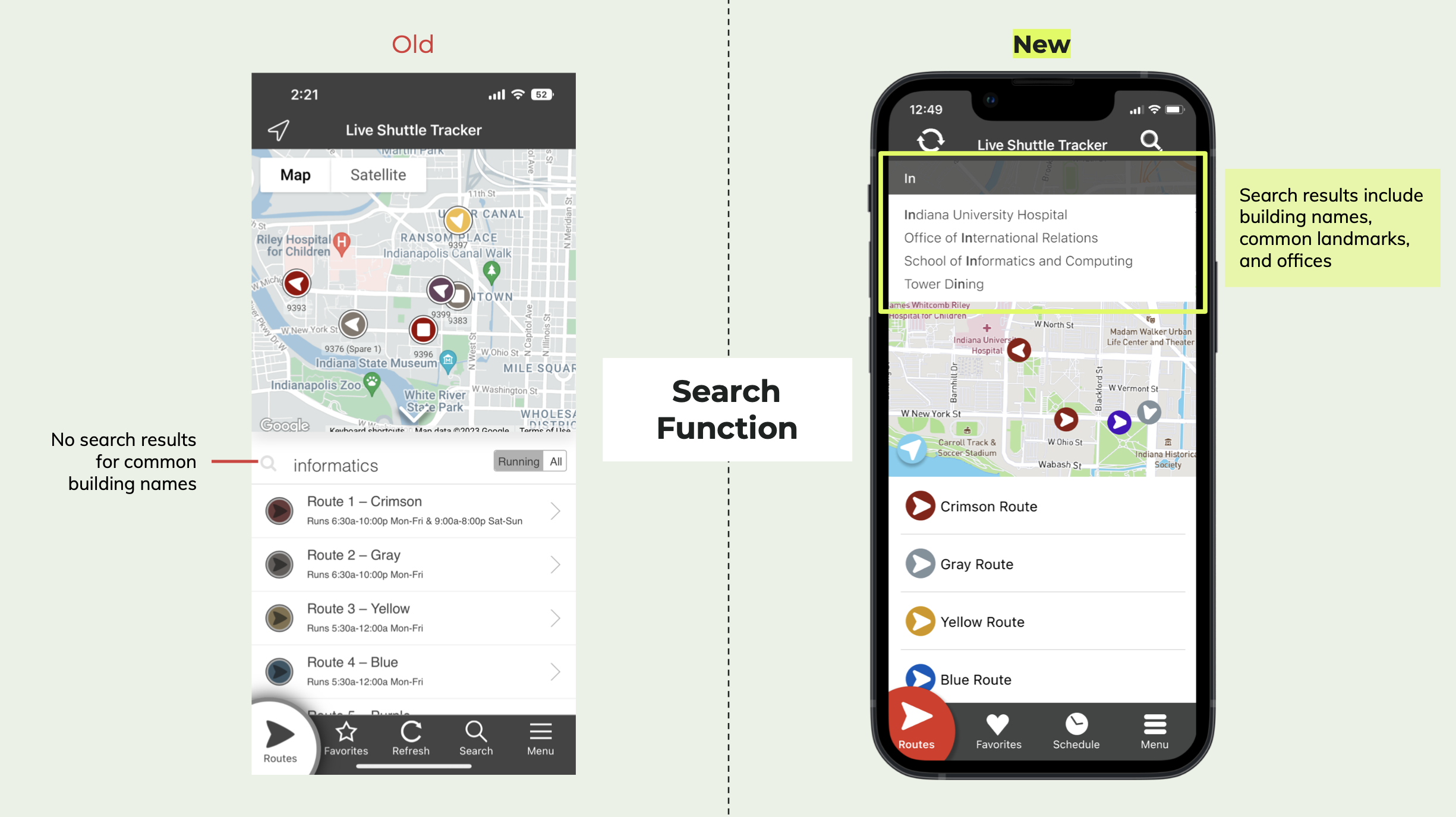
Repeat (Make & Check)
I considered feedback from the first round of checking and prototyped a second iteration. Below are side-by-side comparisons of JagLine's current UI and my final recommendations.


Future Considerations
After iterative design and evaluations, I've identified additional areas of exploration that are essential to the user experience:
The overall map view: Is it useful? Do users need to see a map of all routes?
The fear of running late: Would alarms be helpful? How early do users look at a bus's location? What are users' back-up plans?
The timetable: How many times do users want to see? When do users look at the timetable (i.e. the day before or the day of)?
The ride: What information do users need after they board the bus?

Freeze Release
